

weeroona
Services Provided:
Branding | Website | Custom Indigenous Illustrations | Branded Style Guide
HOW WE HELPED:
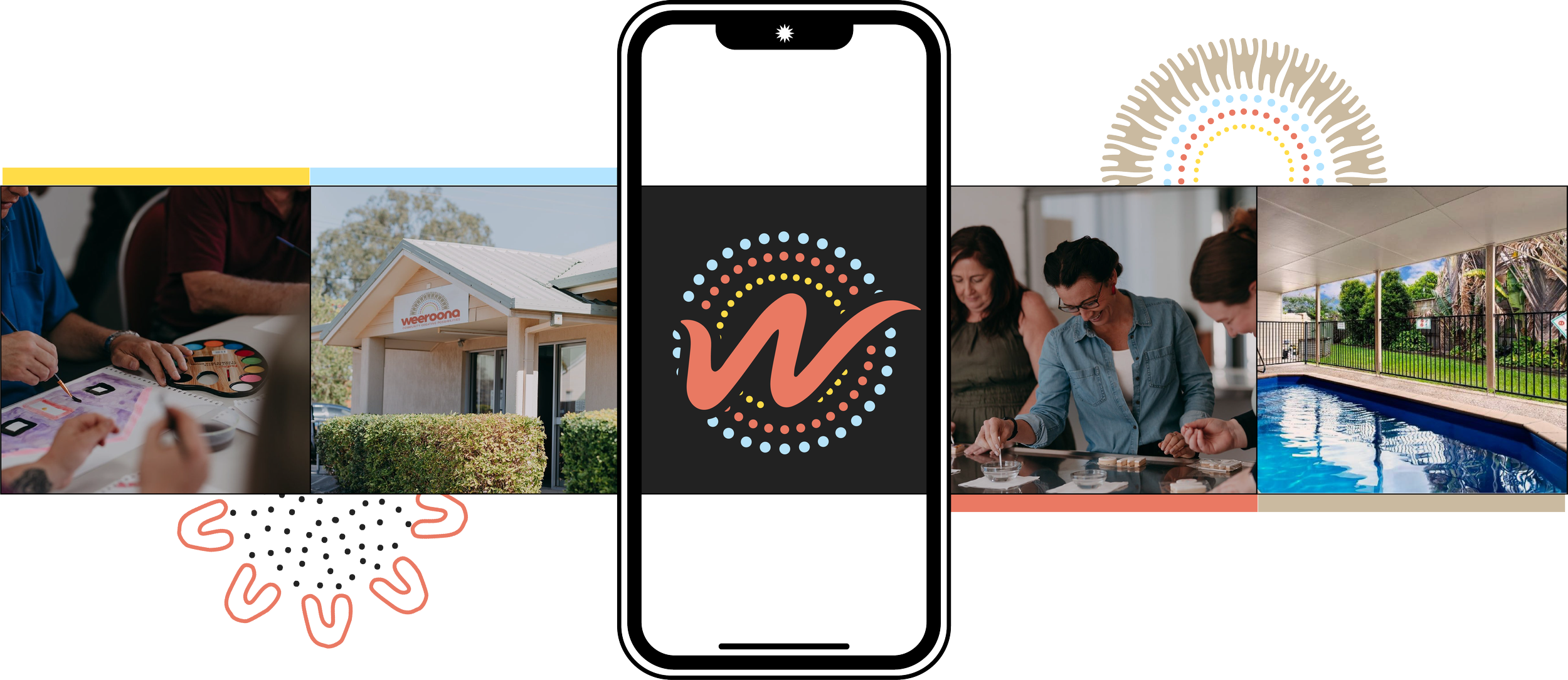
Weeroona is dedicated to empowering people with disabilities to live with greater independence and confidence. Working closely with their team, we developed a brand identity and website that reflects their commitment to quality care and support. From a professional and inclusive design approach to a user-friendly website, every detail was thoughtfully crafted to ensure clarity, accessibility, and trust.


BRANDING
✹
WEBSITE
✹
ILLUSTRATIONS
✹
BRANDING ✹ WEBSITE ✹ ILLUSTRATIONS ✹
Weeroona: Supporting People with Disabilities to Live with Independence
Discover how Smyth Studio partnered with Weeroona to develop a professional and approachable brand identity, a user-friendly website, and a branded style guide that reflects their commitment to empowering individuals with disabilities.
Client Overview
Weeroona is a trusted disability service provider, offering tailored support to help individuals live independently and achieve their personal goals. As a registered NDIS provider, they focus on delivering quality, person-centered care that enhances the lives of people with disabilities and their families.
The Challenge
Weeroona needed a modern, cohesive brand identity and digital presence that would:
Clearly communicate their role as an NDIS provider and the range of services they offer.
Present a professional yet approachable visual identity to build trust with clients and families.
Ensure accessibility and ease of navigation on their website for people of all abilities.
Provide a strong foundation for future marketing and brand consistency.
Our Approach
Branding: Developed a fresh, professional brand identity that reflects Weeroona’s focus on empowerment, care, and inclusivity. The branding strikes a balance between warmth and professionalism to appeal to both clients and industry stakeholders.
Website: Designed a clean, accessible, and easy-to-navigate website that clearly outlines Weeroona’s services, NDIS support options, and pathways for client engagement. The website prioritizes clarity and user experience, ensuring essential information is easy to find.
Branded Style Guide: Created a comprehensive style guide to maintain brand consistency across all materials, covering typography, color palette, logo usage, and brand messaging.
The Results
The rebranding and website development positioned Weeroona as a reliable and professional NDIS provider. The updated look and digital presence enhanced their ability to connect with clients and communicate their services effectively.


